Color Picker Plugin
Introduction
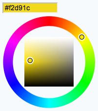
This TWiki plugin packages the Farbtastic color picker , which is a jQuery plugin developed by Steven Wittens of Acko.net. The package adds a color picker to TWiki forms and TWiki applications.
Using the color picker in TWikiForms
This package adds acolor type to TWikiForms:
| Type | Description | Size | Value |
|---|---|---|---|
color |
Single-line text box and a color picker to pick a color. The color can also be typed into the text box, such as #123456. An attribute of type="popup" shows a button that, when clicked, opens a color picker popup. |
Text box width in number of characters | Initial (default) color |
| Name: | Type: | Size | Values: | Tooltip message: | Attributes: |
|---|---|---|---|---|---|
| Background color | color | 12 | Select color | type="popup" |
type="popup" attribute requires TWiki-6.0.2 or later.
Using the color picker in an HTML form
You can also use the color picker directly in your HTML forms, without having to write any code. Just include this in the topic text:
<form action="...">
%COLORPICKER{ name="text_color" size="12" value="#123456" class="twikiInputField" }%
<form>
This will show an HTML input field named "text_color" and a color picker tied to it.
| Parameter | Description | Default | Example |
|---|---|---|---|
name |
Name of input field | (required) | name="text_color" |
value |
Initial color value, in hexadecimal notation for the combination of Red, Green, and Blue color values (RGB). | (none) | value="#0000ff" |
size |
Size of input field, in number of characters | (browser default) | size="8" |
class |
CSS class of input field or the rectangular color block | (none) | class="twikiInputField" |
style |
Style of input field or the rectangular color block | (none) | style="width: 190px; height: 32px" |
type |
Type of color widget: • "below" - color picker is located below the input field;• "popup" - pop-up a color picker window when clicking the button next to the input field (this uses very little vertical space); • "view" - a read-only rectangular block colored in the color value (no color picker);• "view-hex" - like view, in addition shows the color value as an RGB hexadecimal code (no color picker); |
type="below" |
type="view-hex" |
| Additional parameters can be supplied; they will be added to the HTML input field or the rectangular color block. | |||
Using the color picker with disabled plugin
It is also possible to use the color picker in HTML forms with disabled ColorPickerPlugin:
%INCLUDE{ "%SYSTEMWEB%.ColorPickerPlugin" section="code" }%
<form action="...">
%INCLUDE{ "%SYSTEMWEB%.ColorPickerPlugin" section="picker" NAME="demo_color" SIZE="12" VALUE="#123456" EXTRA="class=\"twikiInputField\"" }%
</form>
This will show an HTML input field named "demo_color" and a color picker tied to it. The "code" section should be included once per topic, the "picker" section can be included as many times as needed. The NAME parameter is required; SIZE, VALUE and EXTRA parameters are optional. Use the EXTRA parameter to add additional parameters to the HTML input field.
Test: (this works only if the ColorPickerPlugin is installed and disabled)
Installation Instructions
This plugin is pre-installed. TWiki administrators can upgrade the plugin as needed on the TWiki server.

- For an automated installation, run the configure script and follow "Find More Extensions" in the in the Extensions section.
- See the installation supplement on TWiki.org for more information.
- See the installation supplement
- Or, follow these manual installation steps:
- Download the ZIP file from the extension home on twiki.org (see below).
- Unzip
ColorPickerPlugin.zipin your twiki installation directory. - Set the ownership of the extracted directories and files to the webserver user.
- Install the dependencies (if any).
- Plugin configuration and testing:
- Run the configure script and enable the plugin in the Plugins section.
- Configure additional plugin settings in the Extensions section if needed.
- Test if the installation was successful using the examples provided.
Plugin Info
- Set SHORTDESCRIPTION = Color picker for use in TWiki forms and TWiki applications
| Author: | TWiki:Main.PeterThoeny, TWiki.org |
| Copyright: | © 2007 Steven Wittens, Acko.net for Farbtastic jQuery plugin © 2010-2018 TWiki:Main.PeterThoeny and TWiki:TWiki.TWikiContributor for TWiki ColorPickerPlugin |
| Sponsor: | Wave Systems Corp. for type parameter |
| License: | GPL (GNU General Public License) |
| Dependencies: | JQueryPlugin (pre-installed) |
| Version: | 2018-07-05 |
| 2018-07-05: | TWikibug:Item7841: Copyright update to 2018 |
| 2016-01-08: | TWikibug:Item7708: Copyright update to 2016 |
| 2015-01-10: | TWikibug:Item7604: Switch to GPL v3 |
| 2014-12-29: | TWikibug:Item7601: Implement new type="popup" parameter for popup color widget |
| 2014-12-20: | TWikibug:Item7601: New type parameter to set the type of color widget |
| 2014-12-11: | TWikibug:Item7577: TWiki form field type with configure attributes, color type supports form, onblur, onfocus, onchange, onselect, onmouseover, onmouseout, pattern, placeholder, spellcheck, style, tabindex, title, translate |
| 2013-02-15: | TWikibug:Item7148: Fix for color picker not working if initial value of TWiki forms field of type color is empty |
| 2013-01-09: | TWikibug:Item7091: Dependency clarification; use TWISTY for installation instructions |
| 2012-12-03: | TWikibug:Item7020: Add VarCOLORPICKER with category; doc improvements |
| 2012-08-11: | TWikibug:Item6837: Doc fixes; updated installation instructions |
| 2011-06-11: | TWikibug:Item6725: Change global package variables from "use vars" to "our" |
| 2010-11-30: | TWikibug:Item6610: Rewrite ColorPickerContrib into ColorPickerPlugin |
| 2010-11-27: | TWikibug:Item6609: In TWikiForms type table, automatically list the color form field type defined in this contrib -- TWiki:Main.PeterThoeny |
| 2010-11-26: | TWikibug:Item6606: Complete rewrite of contrib using Farbtastic color picker -- TWiki:Main.PeterThoeny |
| 2006-10-27: | Initial version of ColorPickerContrib by TWiki:Main.FlavioCurti using Colorpicker by Norman Timmler (inlet media e.K., Hamburg, Germany) |
Topic revision: r6 - 2018-07-06 - TWikiContributor

 Site map
 Sandbox web
 User registration
 Users
Users Groups
 Index
Index Search
 Changes
 Notifications
 RSS Feed
 Statistics
 Preferences
")
 Copyright © 1999-2026 by the contributing authors. All material on this collaboration platform is the property of the contributing authors.
 Ideas, requests, problems regarding TWiki? Send feedback
Note: Please contribute updates to this topic on TWiki.org at TWiki:TWiki.ColorPickerPlugin.